Thursday 25 September 2014

Seven title sequence

Se7en title sequence

The lighting in the Se7en title sequence creates a disorientating feel. It does this by flickering. In addition, quite a lot of the lighting is dark, so it fits with the thriller genre as, in thriller films eeriness should be present. Also some objects on the screen are brighter than others for example, a picture of a man with his eyes crossed out. This draws attention to the object and keeps what is going on around it a mystery because the background is dark and the audience can’t see the full picture.
The camera angles in the sequence raises questions as the character is never shown. There are also a lot of close ups and extreme close ups of the characters hands and what they are doing for example, cutting out pictures you can also see him crossing out words on letters and binding a book together. This raises questions to what the character is doing and creates the sense that the characters identity is supposed to be a mystery it also suggests that what the character is doing is wrong and sinister.
The editing of the title sequence creates the feeling of chaos as a multitude of techniques are used. Fast paced frames overlapping and fading out makes the sequence seem chaotic and disturbing which could suggest the characters state of mind. Also the typography used is effective as it looks like messy handwriting this creates the feeling that someone could be responsible for the eeriness so it makes it feel more realistic. Also, some of the colours used are effective as they make certain things white to lift them off the screen and emphasise them.
The music in the title sequence makes the viewer feel on edge as it is tense. Additionally, the music starts off in a slow pace and gradually becomes faster which builds suspense. In the music there are sounds of typing and machinery, this could suggest that the character is in a factory which adds to the creepy setting. It also sounds distorted which has connotations of abnormality, this suggests that there could be something wrong with the character. 
The line across the persons face raises questions as it makes the audience wonder if this person is dead or not. And possibly if the person crossing out their eyes has done anything to the person, possibly they are a victim. The rest of the shot is dark so the audience focuses on the one picture and the typography. This is so the audience actually reads the names. The picture is in black and white, this could be an indication that this is a victim of the past and the murderer wants to cover his tracks. Also, the image is a point of view shot so we can see it from their perspective.
This is an extreme close up of dirty fingers holding a razor blade. This gives a sense of mystery as the audience question why the characters fingers are dirty and why they are holding a razor blade. It also gives an insight into the character as they are probably a messy,dangerous and traditional person. Also there is a dark background so you don't know where this character is. So, this shot entices the audience as they will want their questions answered.


Conventions of a thriller film

Different types of thriller
·         Crime- crime thrillers are different because they usually include detectives and characters with jobs in authority E.g. Seven.
 
·         Psychological- are different as they cause suspense for the audience by affecting your mind. E.g. The Butterfly Effect.
 
·         Science fiction- different because they use sophisticated technology to captivate the audience’s attention and to make the film tense and. E.g. Knowing.

·         Supernatural- different because the director could try and make it look realistic which would scare the audience
 
.Conventions of the thriller genre

Dark lighting to create an eerie atmosphere

Eerie/tense music


Close ups to show the characters emotions
Iconography e.g. knives, guns, mirrors. 
Location e.g.  A city to show normal life and for the audience to relate to it. This would be most suitable for political and crime thrillers.


Title sequence analysis


This image from True Detective’s title sequence tells us a lot about what is to come in the series. For example, overlay has been used where there is a face in the background, almost like a god-like figure watching over the people in the town, possibly judging them; the man is one of the detectives, so the image suits his job. Also we can see a power station in the background which connotes pollution and makes me think that this town isn't a nice place, this could foreshadow later events. I also instantly dislike the setting as it is very bleak and boring. The setting also looks isolated which makes me think it is a thriller genre as the victim is often alone.

The lighting is low key, which adds to the bleak, depressing feel of the title sequence. The camera angle is a long shot, so the audience can see a vast amount of land. This space and isolation compliments the feel of loneliness. Also in the title sequence the music is slow paced which establishes that this programme will be a thriller or a drama as opposed to an action film. It is also western music, so it gives an idea of where the series is set, which is in South America, and what significance it has to the programme.

There are overlapping images which could suggest deception as it looks as if the woman is hiding behind something. Also, there is high key lighting which indicates innocence. Possibly the woman is a victim. The power station suggests that the area is bleak and rough which fits with the nature of the programme.


There are overlapping images which could suggest deception as it looks as if the woman is hiding behind something. Also, there is high key lighting which indicates innocence. Possibly the woman is a victim. The power station suggests that the area is bleak and rough which fits with the nature of the programme.


 In the ‘Sherlock’ title sequence you can see from the image that there is a modern magnifying glass, this shows that it is a modernised version of Sherlock Holmes. Also Sherlock’s face is in the magnifying glass twice, this shows that it is a detective programme as a magnifying glass is a common prop used in detective programmes. Also his face could be there twice to give the sense that he isn’t alone. Or the face that is further away could suggest that Sherlock has a darker side to him as it is more distant and blurry. Also the effect of overlay shows people in the background, which looks like businessmen and women going to work in London. This establishes the setting and also informs us that it is set in present day. Though, the background is quite blurry which could suggest that things could not be as they seem.
The lighting is low key which gives the theme of mystery as you can’t see the picture clearly. Also the close up is effective as we can see the character and his emotions. He looks solemn which could foreshadow what is to come in the programme. Also in the title sequence, the music is quite fast paced which builds up excitement for the action and drama which is to come.
With Held is a student thriller opening. This point of view shot is effective because it makes the audience feel as if they are watching someone. It also gives a creepy feel to the opening which fits in with the thriller genre nicely. The man is in a car in a remote setting which adds to creepy feel as this woman is alone and being watched, so it gives the opening some tension which I think could have been more effective if music was added. There is a contrast in the lighting as there is high key lighting on the woman and low key lighting on the man. This enhances the audience’s suspicions that the man is not to be trusted. The window in the car is dirty which gives the audience the impression that this man has unclean intentions.

typography

Typography

In the Transformers title sequence the typography is effective because the words are bold and stand out. They look as if they are metal which fits the genre of the film. Also the writing is 3-D and transforms the words like the transformers in the film. This links directly with the film and introduces the audience to the science fiction genre.

In The Girl With The Dragon Tattoo the typography is dark which fits with the theme of the film. Also the writing is bold so it draws attention to it. The letters move slightly which gives a creepy feel to the film. The actors names are in white which contrasts the black background and draws the audiences attention to the names.

In the Juno title sequence the typography is effective as they have used large, colourful letters and put them in different places to draw attention to them. Also, the font moves in and out in certain places making the audience more likely to read them. The font looks like someone has drawn them which fits with the genre of an indie comedy.

Tuesday 23 September 2014

Barthes codes


Barthes codes

The hermeneutic code is the parts of the story that aren't fully explained, so it leaves unanswered questions. A detective story operates on the hermeneutic code. Also the unanswered questions aren't generally answered until the end. Sometimes there will be a snare, which is information which will send the audience down the wrong path. There also could be partial answers which gives the audience some, but not all of the truth. You could also get an equivocation. This mixes the truth and a snare. lastly, jamming suggests that the problem is unsolvable.

Some examples,
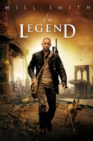
I am Legend- Where you don't know what happened to New York, so it raises questions.
Memento- It's not in order so you question what is going on.
Sherlock Holmes- You spend most of the film thinking Lord Blackwood has powers, so a snare was used.
The proairetic code is when, after an action, you expect a reaction. the aim of this is to create suspense as the audience would be anticipating the outcome.

Some examples,

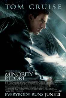
Minority report- When the bubble goes up to the surface of the water, we expect a reaction from the robots.
Harry Potter: Half blood prince- When Harry goes to get water out of a cursed lake it builds tension as the audience expect a reaction.

Saturday 20 September 2014


Hi, this is my first post on my blog. This blog will consist of my progress towards my final exam piece for a-level media. I hope you enjoy.