Tuesday 27 January 2015

production log


We had a few plot changes and discussions and we have finally come up with our final idea. After editing we have around 2 and a half minutes of film but it is not fully completed. We used final cut pro. Our music is nearly finished but we still need to work out how to add it to final cut pro.
This is a screenshot of our opening on final cut. Final cut pro didn't take long to get used to. We were editing almost straight away.
This is our rough cut. We like the shot of me walking in the reflection of the water. Water symbolizes life, so we wanted the reflection in our opening as I am the victim, so we wanted contrasting messages coming across. We also think that our blood hand shot is effective as the red hand print stands out in the natural setting and we wanted the unnatural image to get the audiences attention. We need to add our music as we believe this will complete our opening and we also need to finish our typography as we need to include things like editing.

production log


We immediately decided on our location as we had both decided on the set. We had decided we wanted to be inn a nature setting and I knew a place that would fit our thriller. But when we first went out to film we couldn’t as we didn’t know exactly where the place was. We did eventually find it, only to find that we had forgotten to check if there was a memory card in the camera. We still need to finish off some of our filming.
 This is our location.

production log


We have yet to complete our story board. Though we know where everything is going. We discussed the costume and the props and agreed on most things. We have looked up similar opening and have decided what kind of style we want ours. Our thriller is set in the forest and is about a victim being hunted so we came up with our title ‘natural instinct’. We now need to create the production logo and finish filming.
This is the costume.

Saturday 17 January 2015

Thriller inspiration

https://www.youtube.com/watch?v=G5_HFbGBAkM
One opening we were very inspired by a student opening. We watched the opening as it was also set in a forest so we were interested to see what camera angles and lighting techniques they used so that their piece was not too dark.
. Some of their shots were edited backwards. We think we are going to put some backwards shots in our opening as we believe it is eerie and effective for the thriller genre and it also creates a sense of mystery.
We like the unnatural red against the background. We also like the  yellowy filter they have added to their shots.This makes me feel unnerved because it suggests someone is sick or ill. The flares flash up and create disorientation for the audience.


We also like the harsh contrast between the still nature and the disturbing images.
The music of this opening is simple and slow and builds tension. We want something simple in this for our thriller.

Production logo research

We are going to make our production logo soon so I have decided to look at other film production logos to get inspiration from them.


I like this one as the colours are simple so it stands out. I also like the silhouette of the face as it relates to the audience watching the film.


 I also like this one as the colours are bold and it is clever as they are called FlashFilm and they have a reel of film in the shape of lightning. I would like to do something like this for our production logo.


I like the dreamworks logo as it relates to the genre of the films they produce. So for our logo it would be good if we could make it so the audience would know the genre of our opening


Music for our thriller

At first we had a rough cut of our music. It included lots of high pitch violin to create an eerie tension. We listened to this over our opening and realised that it didn't quite fit so we decided to change it. we started by making simple  low piano tones to build tension, we had to cut these down though as they weren't even, a bit like the jaws theme, we then added some higher notes that sound a bit like violin which we had to move around to create  tension and build the effect we wanted . We still need to add the music to our opening. We are currently struggling on how we can do this.  After we have added our music we can get feedback from it and we can edit it accordingly.
This is our new music, we have managed to add it onto our opening, and it fits but it is very repetitive. Our next job will be to edit the music so it has some range to it and keeps the audiences attention.

Typography timeline

I have looked up what order the names go in for the typography and have found this.
This is from the Catch Me if You Can title sequence. The production company comes first. The sequence fades in and the titles are already up. The black on the blue is bold so it immediately draws the audiences attention.The dark colour also set s the scene as it is night.
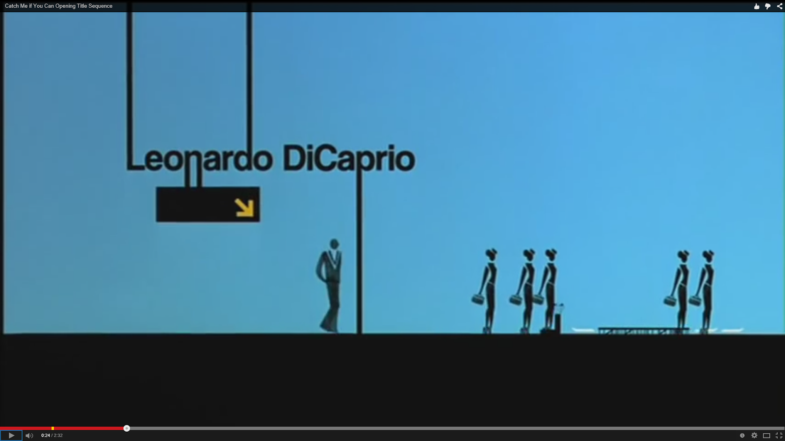
Next, the actors names. Leonardo DiCaprio's name fades in. There is a sign at the bottom of his name. This sets the scene and gives a hint as to what is to come in the film as it is set in an airport, this could also show the significance of the actor in the film as his name is above a sign where people would look..
After that is who created the titles. this appeared on folders. This is good as it also gives an insight in what is to come and it draws the audiences attention as that is where the audience would look.
Then, the music. This is good as the name is next to a piano so it is clear even with out reading it, what they did for the film.the white background behind the black makes the font stand out and draws the audiences attention.
Costume designer, the name fades in and you are immediately drawn to it. Also the figures clothes are bold so you also know what they have done in the film. The ends of the letters go into the animated characters. This will catch the audiences eye so they will be more likely to read it.
film editor, the name fades in. The audience are likely to read it as the pink stands out against the black. the name swings in and out, this makes the opening titles more appealing for an audience as it is more entertaining than watching words on a screen.
producer, the background goes back to the original dark scene, suggesting that the names on the screen are now more important. it also shows that these names are now people that worked on different parts of the film.
And finally the director. Sometimes the name of the film is shown last as well but in Catch Me if You Can it I shown earlier.
this image isn't shown last, this is because they focused more on who created the film. The 'me' in white font swings off to the side with the plane underneath it. This gives an insight as to what the film is going to be about and catches the audiences attention.

production log

We have done the first edit of our opening and it is not looking bad at the moment but it needs more work. We now need to sort out the typography and figure out where we want the names and how to edit the font.

what we need to do next
We need to figure out how to add the music to our opening.

Wednesday 14 January 2015

meeting minutes

What we discussed
On our first meeting we discussed the plot of our title sequence. At first we had disagreements, but then we decided on our idea.
At first it was going to be from the hunters point of view, but we changed it to having the victim as the main point of focus.
We discussed our music as we had made a piece already, but we mutually agreed that it wasn't right for our thriller opening so, we made a new piece together.
At first I didn't want a major focus on a character as it was going to be from the point of view of the hunter but we decided that I would play the victim.
We also decided that Rhiana would do most of the filming as I will be acting in the opening, because of this, I took the lead role in editing.
We decided that we wanted the victim to look innocent so we decided on a uniform like costume.
We agreed on our location. We chose a forest as we wanted to be original as there are not many thrillers set in forests.
We have changed the editing a lot to find what we are both happy with.

Horrors and thrillers

Thrillers are different from horrors as they usually contain more of a storyline. Thrillers rely on tension and building up to the climax whereas horrors usually go straight to the point. A horror films aim is to scare the audience whereas a thriller is supposed to be more of a shock.
Though, the audience can also find thrillers scary as they are more realistic. Also, horrors don't leave anything for the imagination whereas thrillers do which could make the audience think the worst and scare themselves. So, both of the genres have different aims for the audience and both appeal to different people.